This article refers to the former version of the book covers, but, dont let it fool you! The content pages didn’t change.
In love with colors,
vibrant but not fierce.
When we started developing
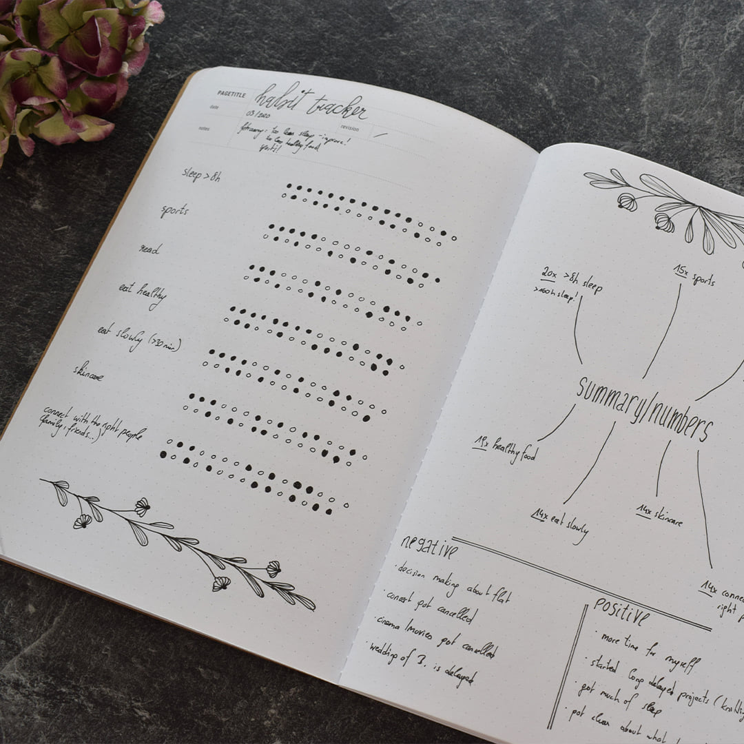
our Books for That, many questions came up. A lot of thinking went into the core pages, as they are what the books really are about.
Then again, books are judged by their covers.
The notebook market
is filled with a countless variety of covers that are designed with patterns and meaningful quotes. But when it comes to single-colored covers, we realized that many manufactures only offer boring standard colors, like Red, Blue, Black, Green and the like. Most of them are way too loud and too cheap – in our honest opinion.
We decided to go with a sober and muted color palette.
We created something that is chic and a palette where different colors go well together.
Basically you choose your base color and decide afterwards how light / dark you prefer it.
We’ve put many hours into
finding the right color shades, and after some time, we found the combination we fell in love with. And for sure, every hue needed to get a sweet name, because that is how we roll.
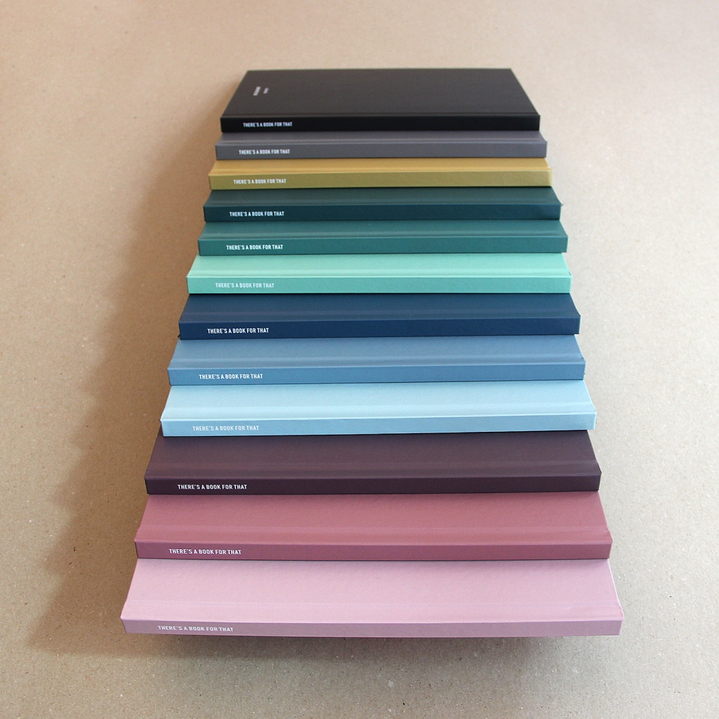
4 Palettes
The Classics – for the basic lovers
Go Greener – our green palette
Fight the Monday Blues – our blue options
Wear the Rose-Coloured Glasses – our purple palette
We decided to split every color range into three parts: A dark, a medium and a light colour version.

THE CLASSICS – for all the basic lovers out there.
The classic covers you can “wear every day”.
These hues include two basic colors and one color to stand out:
Classic Curry –
our signature colour, to make a point and pimp your style
Classic Cement –
a basic version for someone who wants to have something else but Black
Classic Black –
because Black always fits, you know that
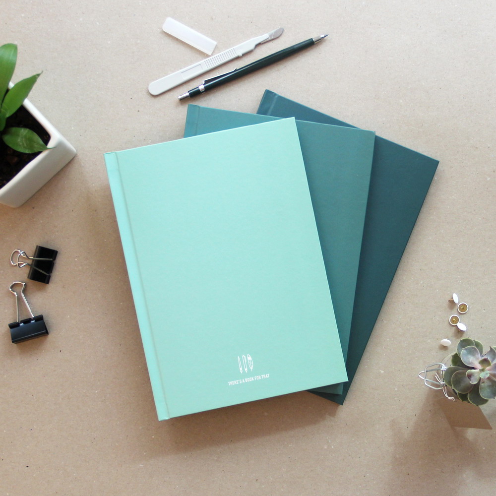
GO GREENER – our green palette.
Our Green collection is for all you chic people out there. Our inspirations can be found in the woodlands of the North, a cold yet comforting shade of green which calms the mind and makes your heart feel at home.
Silence and peace or minty statement? You decide.
Minty Mint –
a young yet not shrill cover option which looks fresh wherever you go
Grass Ain’t Greener –
have this by your side to smell the fresh grass under your feet
Norwegian Woods –
pretty strong, for everyone who loves the silence of the woods

Fight the MONDAY BLUES – our blue options.
Our Blue hues will give you a refreshing kick so you can start your day just right. Inspired by the ocean we found some nice tints which fit in your bag and to your style.
Ice Glow –
fresh like a glacier, this cover option is the lightest of the blue hues
Blue Pebble –
a classy greyish blue, which is always a good option, not too dark, not too light
Moby Dick –
a sober dark blue, classy and chic, for everyone who wants to make a statement
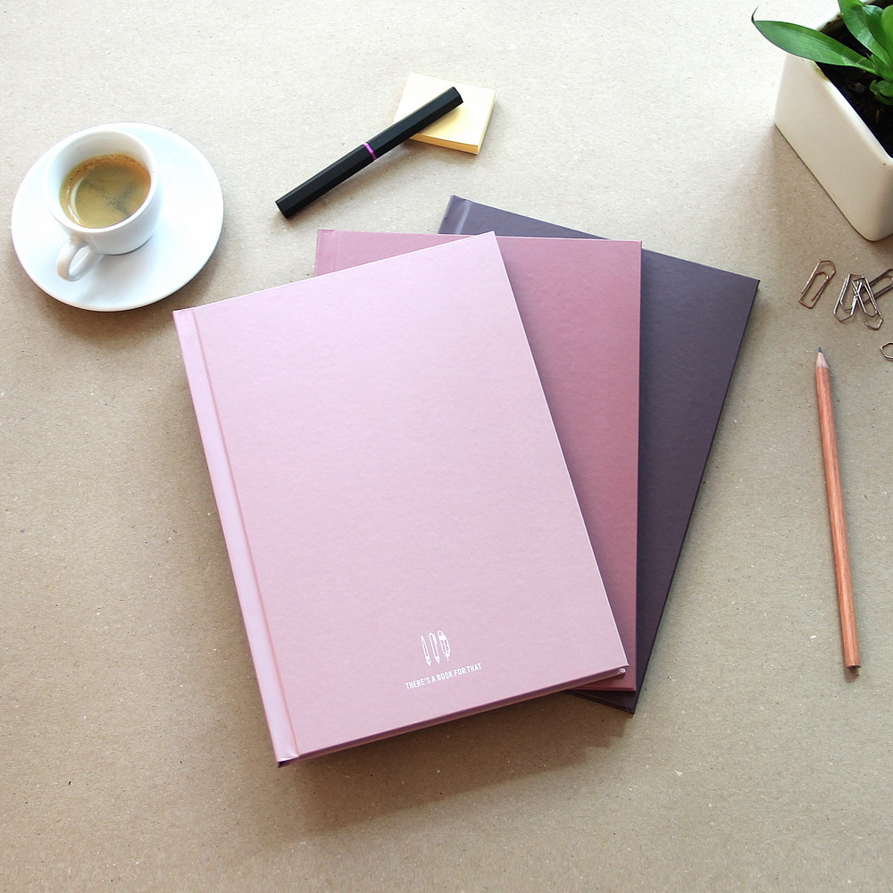
Wear the ROSE-COLORED Glasses – our purple palette.
Our purple washes are for everyone who wants a bit more and wants to make a statement. Hey, not “women-only”, we dare you! Those colors are a statement for everyone, with style. You are not doing things by halves.
Marie Antoinette –
a light rose color shows your love for what is and that you love what you do
Mademoiselle –
this vibrant color is soft yet confident, not your average girly
Mulberry Sorbet –
the taste of fresh berries, combined with a bit of lemon and ice, that is how this color feels like – fresh, self-reliant and creamy
To be honest,
we can’t help with your decision. We love ’em all.
We achieved what we were aiming for: A collections which fits together but every color is also strong on its own.

Important
All our 30 books are available in each color option.

see above
… just check out the swatches below the descriptions of each book!